ENA
PAS DE SITE OFFCIEL
Flexer Design
Nous allons examiner cette question d'un point de vue biblique.
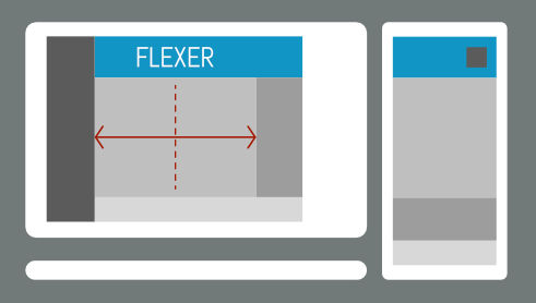
Default Layout
Vertical Nav
Fixed Page
Vertical Nav
Fluid Page
Vertical Nav
Default Layout, Page & Sidebar
Vertical menu On
Desktop: Header and content stay limited to your defined breakpoint width.
Sidebar: The sidebar reflows responsively: vertical columns become horizontal on tablets and return to a vertical stack on phones. This ensures a clean, fully adaptable layout.
Sidebar
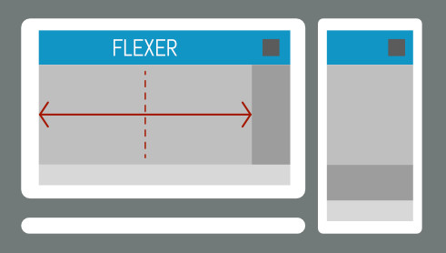
Layout without side navigation
Fixed Page
Vertical Nav OFF
Fluid Page
Vertical Nav OFF
Une initiative privée visant à informer sur les sectes et les doctrines erronées
15 Pl. de la Nation, 75012 Paris, Fr
© 2026 Projet B